13th Colony Sound – Logo, Business Card, & Website Redesign Package
13th Colony Sound, the Savannah, GA chapter of the Barbershop Harmony Society has been a recurring client of mine over the years. Theirs is a well-established local brand. The project was logo redesign/revision, new business cards, and a completely new website (to replace their successful but aging old website).
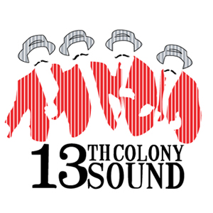
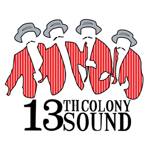
The original logo was produced by a graphic design class at Savannah College of Art and Design. It was an excellent design, however, I believed it needed further refinement. Over the years of doing graphic design work for 13th Colony Sound, I digitized the logo, processed it into vectors, and refined the design, most notably by adding the black outline and removing the pinstripes from the hats.
As 2019 progressed, there were two major things that happened which, in the end, directly affected the 13th Colony Sound logo. First, the Barbershop Harmony Society’s “Everyone In Harmony” initiative (allowing women to sing in the traditionally all-men singing group) was being implemented by the chapter—one of the most progressive in the greater geographical region. The second was I had put a heavy focus in improving the quality of logo design I am able to offer. The identity of the group was changing and the opportunity to make their logo the very best it could be were irresistible.
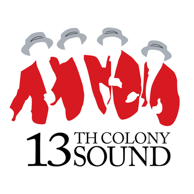
I eliminated all the strokes, except for the detail in the straw hats. I also eliminated the mustaches, and I replaced the old text with one of the most classy fonts in the design world: Garamond. The results speak for themselves.
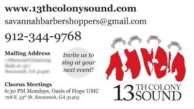
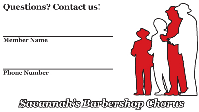
New logo means new business cards, almost automatically. So the business cards were updated to reflect the new visuals.
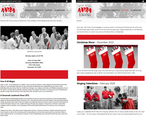
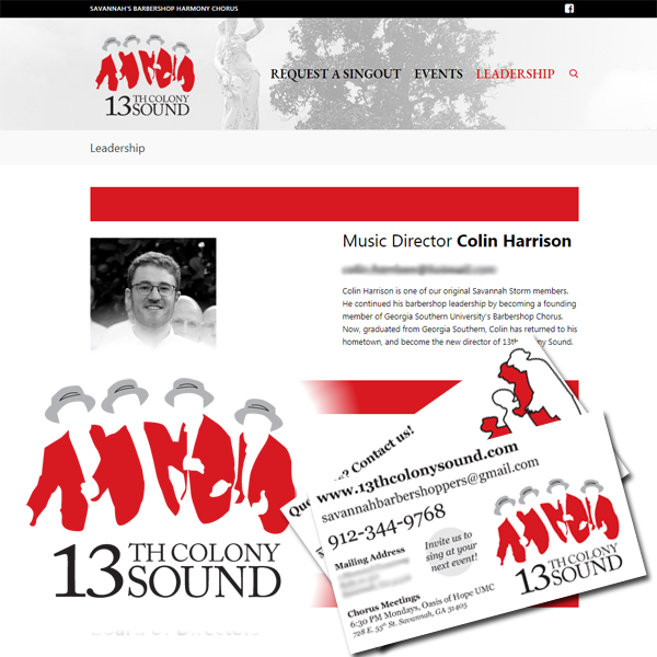
From here it was time to work on the new website. The new logo is the key to all the design elements of that website. One of the first directives I set is that the colors of 13th Colony Sound are red, white, black, and gray. These four colors are the only colors that appear on the new website. This limitation alone gives the new website a distinct, unique look, and a higher sense of class and style. Photos were converted into black and white, with the exception of the reds in the uniform and other striking reds, like balloons, roses, and ball gowns.
Websites are living entities. They grow and change as time progresses, and that is one of the beautiful things about a website. In a few years, this website will most likely be replaced by another. A website’s lifespan is not more than a few years, and in that time it goes through countless changes. Ultimately, a website’s purpose is to serve the person, organization, or community it represents, and this website does exactly that.