Illuminate Church – Logo Package
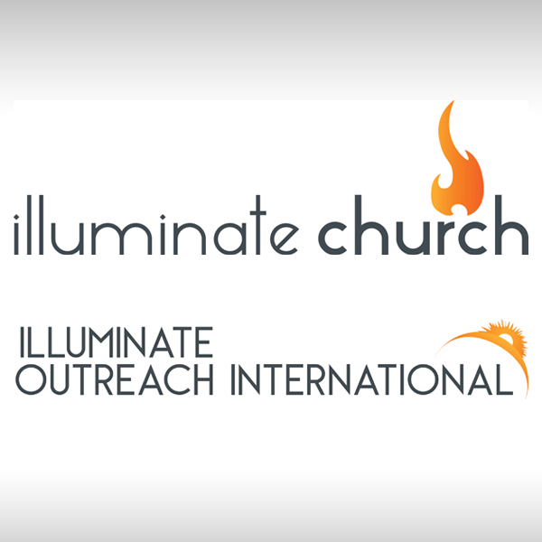
Illuminate Church was a start up church that had a companion missions organization called Illuminate Outreach International. They asked me to create the logos for their new church and its companion missions organization. The name “Illuminate” caused the design to revolve around ideas related to light, particularly Christian/Biblical ideas.
The most natural subject for this idea is a flame, however, the design of the flame had to be carefully considered. United Methodists have one type of flame, Baptist Churches might use another, Presbyterians, Catholics–each denomination or segment of denomination may have its own design of flame that conveys a connection with them. As this was a non-denominational church, it became critical to come up with an effective design that did not communicate a non-existent affiliation. This design was settled upon and agreed to by the client.



I typically begin with black and white silhouettes to work out the design, however, in this case presenting it in a “flame” color to the client was also important in refining the design process.
For Illuminate Outreach International, I used the same basic format, except I made all the text capital letters, and I changed the graphic. A flame is a great graphic for a church, but for International missions, I sought a way to convey “illuminate” on a global scale. The Sun rising on the Earth was the image I ultimately chose. Working out this design in black and white silhouette, the Sun’s corona became a more distinct portion of the design.


When all designs for both logos were approved by the client, I compiled a package containing all the logo variations in multiple file formats. Particularly as the main logo designs were in horizontal format, I included versions of the logo in a square “box” format in the final package.

