“Western Civilization: What a Good Idea!” – Promotional Package
The Notre Dame Club of Savannah was hosting another lecture in the Hesburgh Series and asked me to create the promotional materials for the event. I was their graphic designer for the previous year’s Hesburgh Series lecture, and they have also used me for other projects and events.
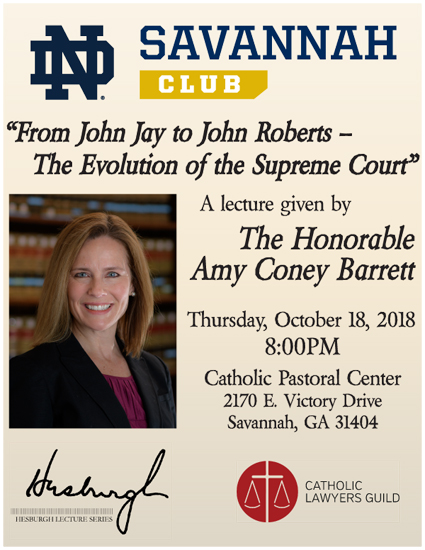
The previous year’s Hesburgh Series lecture was given by The Honorable Amy Coney Barrett, long time judge and one of President Trump’s top three candidates to fill the then most recent open Supreme Court Justice position. The Catholic Lawyers Guild were also involved in the putting on of this event.
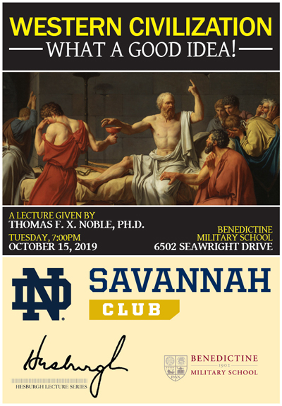
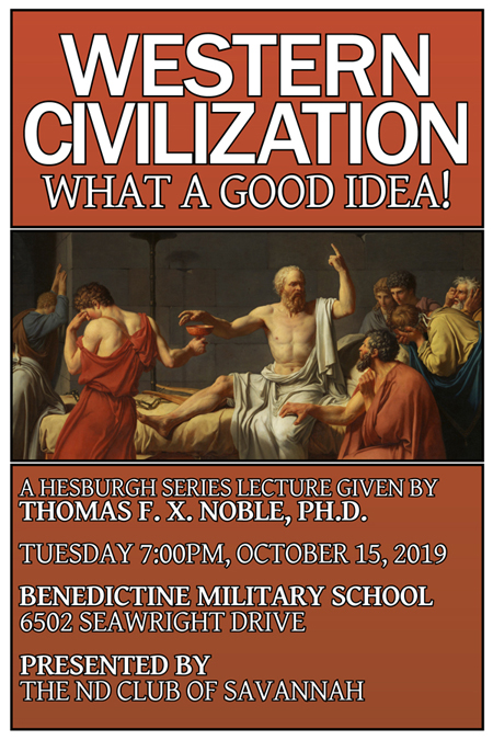
For the new Hesburgh Series lecture, I first approached the design the same way as before, however, there were a few new challenges. First, we did not have a high resolution photo of the speaker (this is a common challenge in design work). This created a vacuum in the visual elements of the design, so I sought a major visual element to take the focus. Given the topic, I searched through my archive of classical paintings (all of which in the public domain), and I found “The Death of Socrates” by Jacques-Louis David. This image seemed quite appropriate, as Socrates, the father of Modern philosophy and a pillar of Western Civilization, believed in what he was doing enough to die for it. The painter, Jacques-Louis David began his career during the French monarchy, rose in success during the French Revolution, and survived all the way into the service of Napoleon Bonaparte, painting the most famous portrait of him. These things seemed to encapsulate the topic in the most potent way I could think of. With this as the biggest visual element, I began to design the rest of the promotional material around the designs set forth by the famous painting.
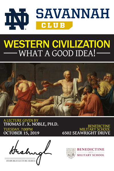
The second challenge was all the logos. Three separate logos on the same small promotional design, each with their own design aesthetics—Too many chefs for too little stew! It was beginning to look like a race car, and this distracted from the message of the design.
The solution was to remove the logos from the design and capitalize more on the single visual direction of The Death of Socrates painting. I took the reddish-orange from the painting and used it throughout the whole design.
This design was approved by the client, and the client received it in two formats: 8.5″x11″ letter-sized poster and a 4″x6″ postcard size..