Space Game – Conceptual Artwork
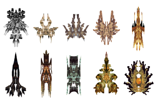
The client was in need of artwork for an online game. I was asked to create concepts of space ships for this game and given a few details about the various classes of ship. Other than this, the art direction was left mostly open. To start out with, I created a series of silhouettes by going into Photoshop and using the lasso tool to select random, interesting shapes from pieces of photos–I believe all were from art history images I had on my computer at the time. I combined these random shapes into symmetrical designs that looked like they could be a space ship.
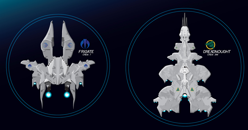
Once this stage was completed, I selected two silhouettes to bring to completion to show the client. The second from the left on the top row became the Frigate. The second from the right on the bottom row became the much larger Dreadnought.
The internal forms implied by the shadows and highlights on the images used helped direct the internal shapes for the ship designs. I brought the designs to completion in Adobe Illustrator, adding a standard engine glow wherever engines were located, and I surrounded each with a double-lined circle that could either indicate shields or selection.
One detail I added to these ships were icons/logos that could be customized and added to the ships to indicate which player the ship belonged to. I drafted up two icons, placed them on the ships in various locations, and for the red logo (used for the Frigate), I modified the colors to blue and purple to indicate the suggested customization option.
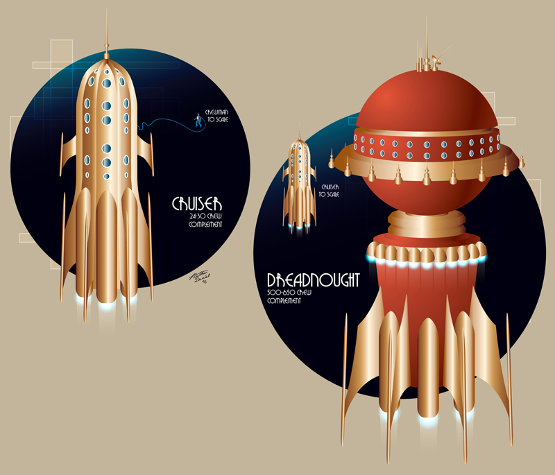
Before I submitted the designs, I realized there was a completely different direction to take the designs. Being a big fan of the retro space designs seen in Flash Gordon, Buck Rogers, and similar works of the early 20th Century, I opted to create a second concept set, this time showing the Cruiser instead of the Frigate. Retro Space artwork has a certain art deco stylization I found particularly attractive from a design standpoint, and from an art direction standpoint, the style is seldom, if ever, used in games of this type, and thus could set the game apart from its competition.
The presentation for this second set of designs used the same gradient to indicate space, however, additional design elements were added to convey a more art deco stylization to help sell the approach.
